Grades 6-8, 9-12
Happy EconEdMonth! Celebrate economics all month long by visiting EconEdMonth.org
Don't have an account yet? Sign up for free
Using poverty rate as a measure of development, students select countries five at a time to compare how resources are allocated to three economic sectors (agriculture, industrial, service). After making comparisons, students will identify patterns in which sector is emphasized by the wealthiest countries, and will look for patterns in the geographic distribution of countries.
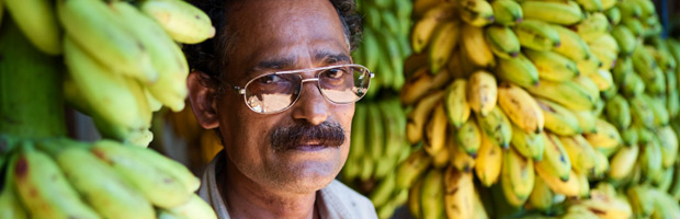
Food is a basic human necessity. Yet some countries have had long-standing problems supplying food for their citizens, many of whom suffer from malnutrition and even starvation. Shouldn’t those countries devote more of their resources to farming so that they can avoid such calamities? Are countries in which more people are involved in agriculture better off than countries where people are engaged in other economic sectors?
Using the data provided to compare countries, students working on this lesson will determine what the relationship is between agriculture and poverty rates. They will also formulate hypotheses to explain the patterns they find.
Your students will first need to get the worksheet that accompanies this lesson. You can choose either the print friendly version or the online interactive version. Answers to worksheet are provided below in the Evaluation Activity Section.
Next have the students choose a continent from the map in the “Explore It” activity. The table will supply them with information pertaining to the GDP and the percentage of its country’s population at or below the poverty line. National estimates of the percentage of the population lying below the poverty line are based on surveys of sub-groups, with the results weighted by the number of people in each group. Definitions of poverty vary considerably among nations. For example, rich nations generally employ more generous standards of poverty than poor nations (from The World Factbook ). When the students click on a continent a table will appear with data on percentage of GDP by sector and percentage of population below the poverty line. These tables can be rearranged by clicking and dragging them. Repeat the process until enough information is gathered to form a hypothesis about the relationships. Then have the students answer the questions on the worksheet.
Here is a complete table of 25 countries providing information on GDP and the percentage of the country’s population at or below the poverty line.
For example, click on North America and rank the countries from highest to lowest on ‘poverty rate.’ Now look at the column titled, ‘% GDP Agriculture,’ are the countries in order from highest to lowest on this statistic also? If not, are they in order from lowest to highest, or is there no pattern to their order. Likewise, compare the ranking on poverty rate with the ranking on the other economic sectors to see if there are patterns. Repeat this comparison with each of the other countries as well.
There are myriad reasons why countries experience poverty. Examining the similarities of these countries suggests an approach to eliminating the causes of poverty.
The information strongly suggests that countries with a HIGH GDP from agriculture also have a HIGH poverty rate. (For the 25 countries in this data base, Pearson r = .75) Regardless of the samples of countries students select, they should discover this relationship. Similarly, countries with a HIGH GDP in the service sector have LOW poverty rates (r = -.72). [Pearson r values range from 1.0 perfectly correlated, to -1.0, prefect opposites.]
There are, nonetheless, exceptions to this pattern and a good follow-up activity is to identify some countries that don’t fit and form a hypothesis to explain the counter-examples they represent.
Suggested questions and answer:
Grades 6-8, 9-12
Grades 9-12
Grades 9-12
Grades 9-12